
- August 21, 2023
- Uncategorized
- No Comments
Test Blog
If you knew something as easy as adding images to your blog posts would increase your readers, subscribers, followers, and leads, wouldn’t you do it every single time?

According to Jeff Bullas, articles with images get 94% more total views than articles without images. Ninety-four percent! If I were to tell you that you could expand your reach by 94% by doing something fairly simple, I’m guessing you wouldn’t think twice.
Of course, “simple” is relative. I don’t mean you should take five minutes to scope out some stock photos and then insert them randomly into your posts. To get more eyeballs on your blog, you’ll have to be more strategic than that — and this blog post will help you get started with that strategy.
Follow the eight tips below to learn data-driven tips that will help you squeeze the most value out of images in your blog posts.
Speed Up Your Website with HubSpot’s Built-In CDN
8 Data-Driven Tips for Using Images in Blog Posts
1) Use images of real people.
In one of Jakob Nielsen’s usability studies, he discovered that pictures of people are one of the most engaging forms of web content.
Nielsen’s data showed that users spent 10% more time looking at pictures of people on a page than they did reading the biographical content associated with the pictures. Even though the text content took up 316% more space, and was thus more quantitatively dominate, users preferred looking at the pictures.

But Nielsen offers a critical disclaimer: Some types of pictures are completely ignored — typically the generic images that are purely decorative. To show this, he analyzed the image on the Yale School of Management website and discovered that the stock-style photo on the right side of the page received very few eye fixations:

Describing it as “pure filler,” Nielsen advises using images that are relevant to the user experience. Images used in an article just for the sake of using an image can be unhelpful.
But if the image has a purpose, like helping to explain a concept, emphasize a point, translate to an external page or email, or show personality, then it can only help you. For example, I use a headshot in my website because it’s a professional courtesy and an engagement marker.
2) Combine photos and text to increase viewer retention and engagement.
In a study conducted by Socialbakers, researchers discovered that images on Facebook constituted 93% of the most engaging posts, compared with status updates, links, and even video.
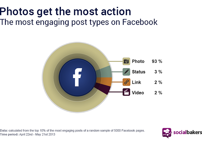
Although this data is specific to Facebook, the principle holds true for blog content as well.
The appeal of pictures is known as the “picture superiority effect.” According to the dual-coding theory, the human memory has two main forms of retention: verbal and imaginal (directly related to the word “image”). Images encode concepts onto our memory in a concrete way, rather than the abstract form of verbal concepts.
This video from Digital Splash Media explains the picture superiority effect, making an overwhelming case for the importance of images.
3) Optimize your images so they load quickly.
Even though the days of dial-up sluggishness are behind us, we still crave quick load times. As you’re probably aware, quick load times are important for SEO — and the source of greatest lag are often clunky plugins and huge images.
The optimal load time is still being debated. A study by Akamai says that two seconds is the “new threshold of acceptability for ecommerce web page response times.” According to their data, 47% of viewers want a two-second load time.
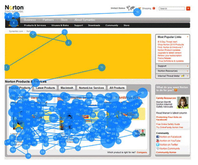
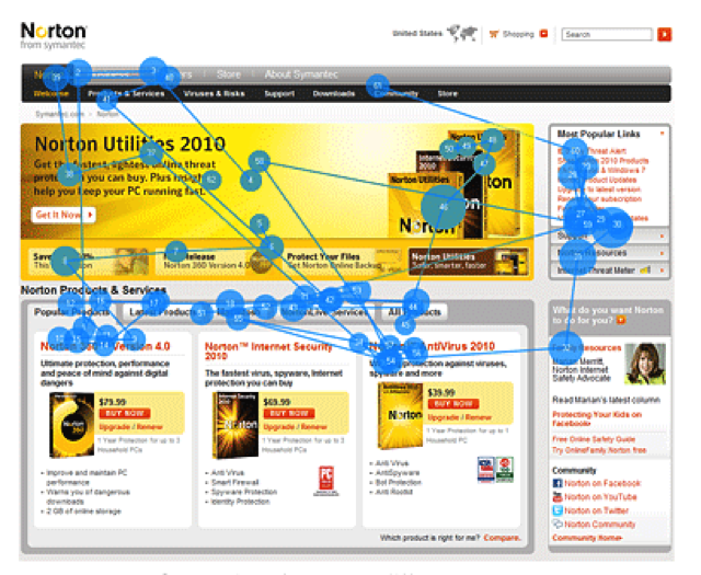
In another study by the Nielsen Norman Group, users in a test were asked to look at a page with a large header image that took up 23% of the page. The picture below shows a gaze plot of a user looking at a landing page. The slider image (yellow) took eight seconds to load; as a result, the user spent a mere 1% of their time looking at the image.
When the image loaded quickly, the user spent 20% of viewing time looking at the image.
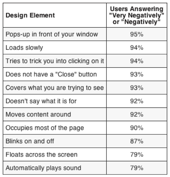
Surveys indicate that slow load times are one of the most-hated features of a website. Not only will you lose the value that the image could provide, but you’ll also plain old tick off users.
A few seconds is all it takes for a user to lose interest and completely ignore the slow-loading image. You can’t control the user’s connection speed, but you can control the speed of your own website.
Note: Hubspot recommends that photos should be smaller than 100KB in order to load quickly.
4) Present information in visual formats, like infographics.
Many studies have found that the human brain processes images much faster than text. This data coheres with the picture superiority effect, and its impact upon marketing is huge. Your readers will absorb your content far easier if you put it in picture form.
According to Mike Parkinson, “the human brain deciphers image elements simultaneously, while language is decoded in a linear, sequential manner taking more time to process.” Showing is better than explaining in many cases.
Let’s take a look at an example. Which of these is easier to understand?

Most of you would say the leftmost depiction. It’s common to say, “I’m a visual learner,” as opposed to someone who learns better by reading or listening to information. The fact is, all of us our visual learners — our brains are wired that way.
This data is one of the reasons why I’m a major proponent of using infographics as part of a comprehensive content marketing strategy. (Here are five free infographic templates in PowerPoint to get you started.)
5) Use high quality images to establish credibility.
In case you think that pictures are simply a way to increase engagement or interest, listen to this point: According to the Stanford Persuasive Technology Lab, overall visual design “was the number one criterion for discerning the credibility of the presented material.” There are a lot of factors involved in “visual design,” but good quality images need to be present.
6) Use images to support persuasive copy and in calls-to-action.
A study from the University of Minnesota School of Management and the 3M Corporation analyzed the effectiveness of presentations that contained visual elements and those that did not. The presentations containing visual elements were 43% more effective at converting users to agree with their point of view.
Ecommerce is all about the art of persuasion. We as marketers are trying to compel people to take a viewpoint, click a button, or make a purchase. Let’s not forget that we can become far more persuasive simply by using images.
7) Position your lead image to the right or left of the first paragraph in your post.
According to Buffer, people are more likely to read an article that have an inline image to the right or left of the leading paragraph.The pattern looks like this: